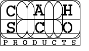
A journey through the start of CAHDSN Logo branding to the end product. On the left is my first logo for CAHSCO which was my name with Scotland attached. I thankfully only used this for a short while before changing it. I find now there was far too much going on with it and the rounded C didn’t work.
CAH Logo (5 yrs ago)
CAH Logo Tri (5 yrs ago)
CAH Designs (2 yrs ago)
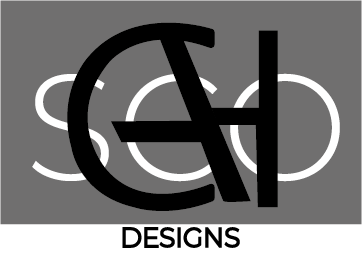
These are the first logo designs I did back in S5 and S6 of high school for graphic communication. Very little design principles were thought about here. The more simple of the three was used all the way through my Advanced Higher project then I stopped using it.
CAHSCO Logo (2 yrs ago)
CAHSCO Logo 2020
First of the New
Third of the New
Second of the New
CAH Logo
On the start-up of my design Instagram account, I used the top left image for the logo. I liked having so many lines around the letters but for proper branding it is far too messy.
The rest are a nice progression to the final logo that is used in the clothing side as well as future projects.
Montserrat Light font was used for the final logo text and throughout the whole website of cahdsn.com